Top Tips to Working with Text in Automatic Video Generation
Contents
Text walks a tightrope in video content—ideally, it is present but not overwhelming, informative yet visually compelling. When used strategically, text bridges the gap between visual storytelling and clear communication, conveying context that images alone cannot capture.
In automated video generation, text faces a unique challenge: adapting dynamically while maintaining visual integrity. Design becomes critical—the text must be bold enough to capture attention, yet clean enough to ensure easy comprehension.
Poorly executed text can derail an entire video's impact—and it goes beyond being overlooked. Subpar text design can:
- Weaken brand professionalism
- Obscure key messages
- Create visual noise that distracts from core content
- Reduce viewer engagement
This guide will help you transform your approach to text in auto-generated videos, designing messages that not only communicate but captivate. By applying classic typography principles and maintaining template versatility, you'll create videos where text doesn't just exist—it sings.
Common Errors of Using Text In Video
To understand how to design effective text in video, let’s start by looking at some common errors that make your content less impactful:
Poor Legibility
Viewers need to be able to read the text in a video. Illegible text looks unprofessional and means your message is lost to the audience. Some common legibility blunders are:
Using Raster Text Instead of Vector Text
Rasterized images lose quality when enlarged, resulting in blurry, pixelated characters if scaled too drastically. They might be unavoidable when you’re working with text logos and other non-modifiable assets, but they should only be used at similar scales.
Failing to Consider Contrast
Placing text on changing backgrounds (which is often the case when you’re working with video) means ensuring it remains legible throughout its time on-screen. Allowing text to fade into the background, not using shadows or text backgrounds, or selecting colors that don’t contrast well can discourage viewers from wanting to read your text at all.
Using the Same Placement and Padding For Different Formats
Different devices and platforms should be treated differently. Failing to consider each device or platform’s safe zones can mean text falling off-screen or being obscured by overlays.
Misjudging Weight and Spacing
Choosing the wrong font weight and character spacing can make content difficult to read. Overly thin fonts can disappear into the background, and densely packed letters can create visual confusion. Effective text requires carefully balanced font weights and strategic letter spacing, ensuring readability and visual clarity across different backgrounds and screen sizes.
Paying attention to technical details like resolution, contrast, and scalability is crucial in text design.
Meow Memo 🐱: The video used in this article’s samples is by Luz Calor Som.
Typography Mismatches
Typography is the visual language of your message. Your text should match the mood and message of your video, creating a cohesive narrative experience. Selecting a playful font when you're trying to convey a serious message results in mixed messages that can confuse or undermine your communication. The typography you choose should guide viewers' emotional interpretation before they even read a single word.
Timing & Duration Issues
Poorly timed text can create cognitive dissonance, either lingering too long and boring viewers or vanishing so quickly that the message is incomprehensible. Failing to make sure there’s a comprehensible amount of material on the screen for an appropriate duration can severely impact the effectiveness of the text.
Best Practices When Designing Text In Your Clipcat Videos
Now that we’ve explored the potential pitfalls in video text design, let's focus on the best practices that will take your automated Clipcat video text from unreadable to exceptional.
Pay Attention to Typography
As often is the case with text, less is more—but that doesn’t mean you can slack off. In fact, it’s especially important to follow the basic rules of good typography to ensure your video text is compelling and easy to read. Clipcat offers an abundance of font choices, spanning different moods and styles—but choosing one is just where it starts.
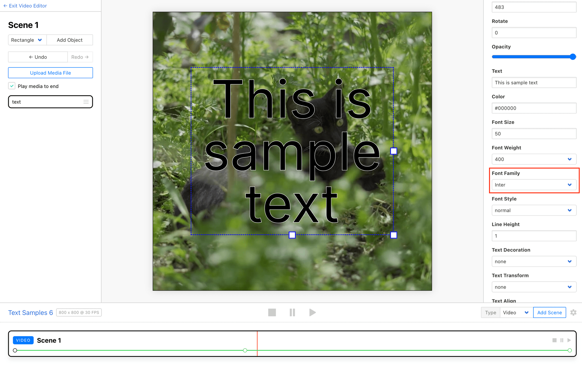
If your text needs to communicate a clear order of importance, use typography rules to establish a clear visual hierarchy. Use bolder, larger fonts for prominent headings, and choose lighter weights and smaller sizes for supporting details.
Meow Memo 🐱: It’s generally recommended to keep the number of font families in a design down to a minimum. Instead of using a different font to establish hierarchy, try playing around with weight instead!
In Clipcat’s editor, you can alter weight, spacing, line height, padding, and more. By applying established principles of good typography, you can design text that not only effectively communicates your message, but also showcases your careful attention to detail.
Create Versatile Contrast
Maintaining clear text legibility across varying video backgrounds is crucial. Clipcat provides several tools to ensure your text stands out even when automated generation means input data varies.
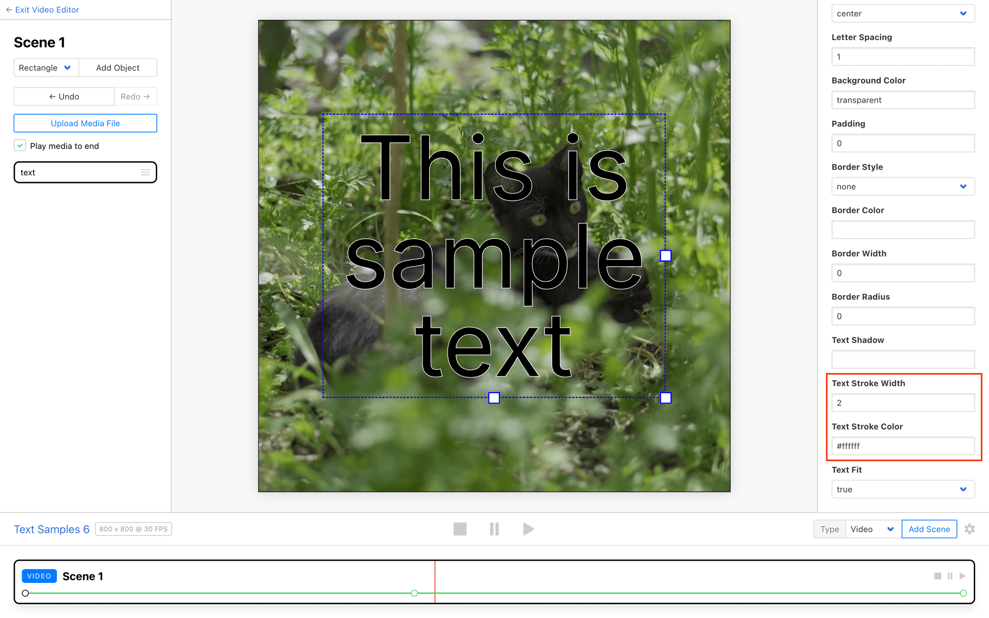
One effective technique is adding a stroke or outline to your text. This defined edge makes letters pop, even over busy backdrops. Clipcat lets you adjust the stroke color and width to find the perfect balance.
You can also enhance contrast with a subtle drop shadow. Offsetting and darkening the text creates depth, preventing it from blending into the background. Customize the shadow's color, opacity, angle, and distance to integrate it seamlessly.
Meow Memo 🐱: Clipcat uses CSS-style formatting for drop and box shadows. You can insert values for horizontal offset, vertical offset, blur radius, spread radius, and color as a string under the Text Shadow property.
Another option for maximum visibility is to place your text inside a semi-transparent background shape. Clipcat makes it easy to add rectangle or rounded rectangle (using the Border Radius property) backgrounds behind the letters, which you can style as needed.
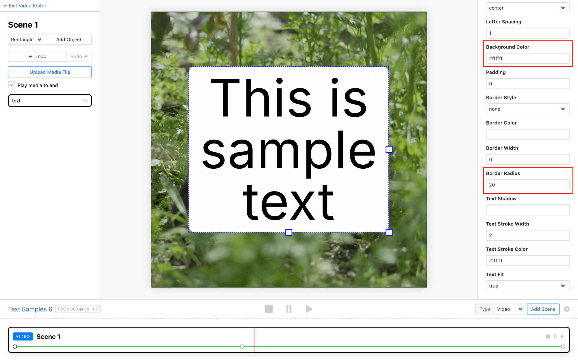
By leveraging Clipcat's versatile text styling options, you can create dynamic, readable text that holds up across a wide range of video visuals and styles.
Optimize For Adaptive Text
When working with dynamic text in your Clipcat videos, it's important to ensure the message remains readable and visually consistent, even as the content changes. Clipcat offers several ways to better control this:
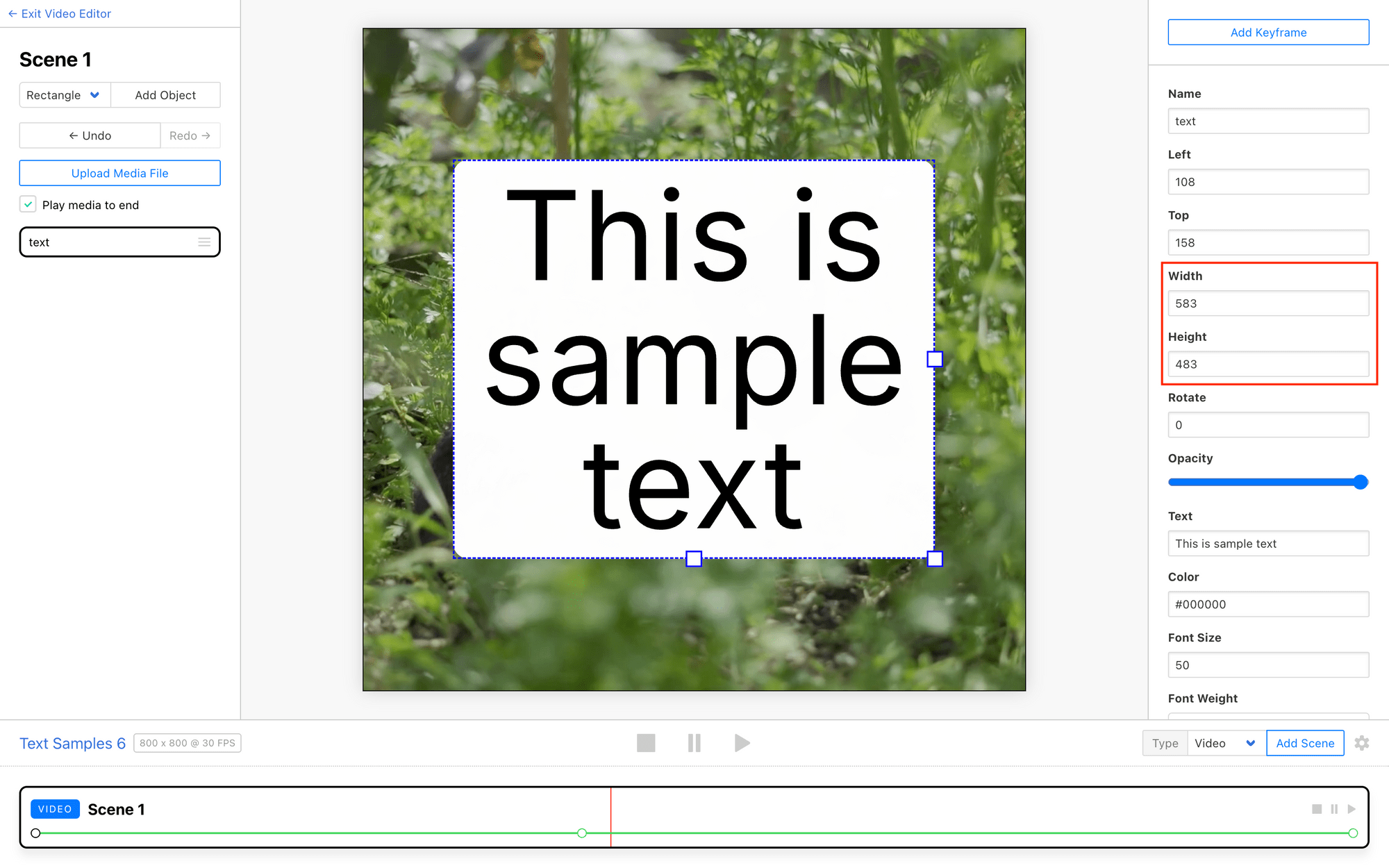
Create a fixed textbox size by configuring the width and height of your text element. This helps maintain a consistent space for the text, preventing it from running over or scaling drastically.
You can also toggle the Text Fit setting to true or false, depending on your needs. Turning Text Fit on will ensure your text always resizes itself to fit the container, which is helpful when working with strings of similar lengths. Turning it off will maintain the same text size, which is better for use cases where size consistency is more important.
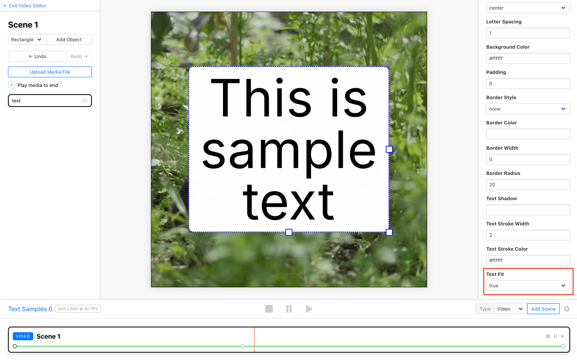
Another helpful step is to set up failsafes that help you avoid text that is too short or too long. This can be done in many ways, such as by using an IF formula that only approves strings within a certain safe character or word count range. This helps ensure your dynamic text stays legible and visually balanced throughout each generated video.
By configuring these text adaptivity settings in Clipcat, you can create videos with dynamic text that is both informative and visually appealing, no matter what is being displayed.
Conclusion
Designing effective text in automated video generation requires thoughtful attention to typography, contrast, and adaptability. By following best practices around font selection, contrast, and sizing, you can create video text that is both visually compelling and highly readable. With Clipcat's robust text styling tools, you have the power to craft dynamic text that seamlessly integrates with your video content, ensuring your message is communicated clearly and with an impact.
Want to design better text in your Clipcat videos? Check out these articles:
👉 Clipcat's Crash Course to Designing Lower Thirds (+ Video Template Guide)
👉How to Turn Quotes into Eye-catching Social Videos with Clipcat
👉5 Dynamic Text Animations You Can Add to Your Clipcat Videos [+ Templates!]
👉Create Engaging Video Overlays with Rectangles, Circles, and Text in Clipcat: A Guide with Examples

